RS IDENTITY DESIGN | Corporate, Product & Event Branding

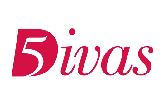
Client:
5 Divas
Project:
Online blog hosted by 5 women. The combination of letterforms communicate both strength and femininity, while the 5 and the D illustrate interactivity.

Client:
Greater Newburgh Symphony Orchestra
Project:
30th Anniversary logo incorporating GNSO's existing logo letterforms
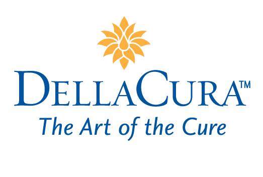
Client:
DellaCura Ltd.
Project:
100% natural skincare products comprised of essential flower, fruit and nut oils
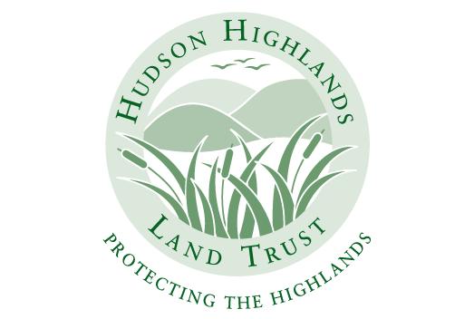
Client:
Hudson Highlands Land Trust
Project:
Not-for-profit land conservation organization. The logo accurately depicts the region's geographic terrain, while the outer circle symbolize the protection of it.
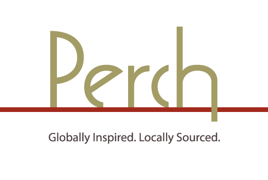
Client:
Perch Restaurant, Marlboro, NY
Project:
Visually communicates the concept of the name and interior art deco architecture
Client:
The Aspen
Project:
Upper Eastside luxury rental building
Client:
Court Square Place
Project:
Residential building. The logo represents the building's exterior, architectural design.

Client:
Badey & Watson
Project:
Logo redesign/modification of the business's former one.
Client:
Dura Tile & Stone
Project:
Residential and commercial tile and stone installation company
Client:
Norki (via Marketing Works Now)
Project:
Product logo for a heating system that runs on waste oil that the system itself first recycles.
Client:
Shoe Stop
Project:
Shoe store logo
Client:
KidAbilities
Project:
Pediatric occupational and physical therapy practice
Client:
Topfield Equestrian Center
Project:
Therapeutic Riding
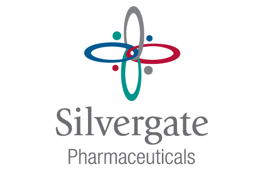
Client:
Silvergate
Project:
Silvergate reformulates and manufactures medications to meet very specific needs in the marketplace. Among the objectives, the logo had to incorporate symbolism of the company's four principles.
Client:
Eating Recovery Center | Pathlight Mood & Anxiety Center
Project:
Logo for Sales Force page
Client:
Builders Atelier
Project:
Hi-end, custom residential builder. The client requested a logo without imagery, as they expected to offer a variety of services in the future.
Client:
Boorom
Project:
HVAC company
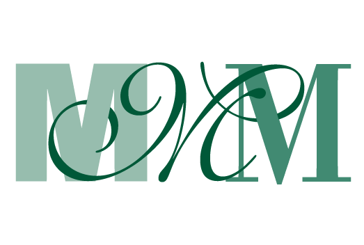
Client:
Marie M. Merton Group
Project:
Real estate management company. The three contrasting styles of Ms not only represent the company name, but also the three distinct, yet interconnected phases of the client's life, making this logo that more meaningful to her.
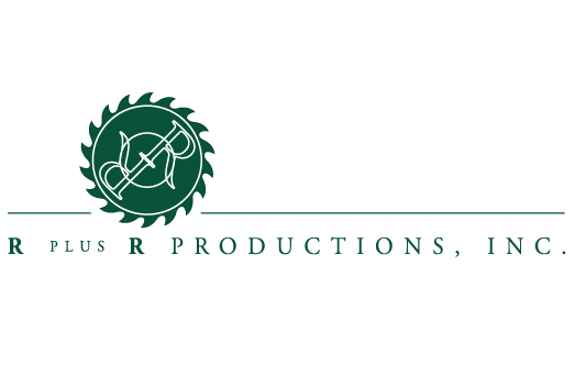
Client:
Richter+Ratner, international designer of custom retail environments and fixtures.
Project:
Logo for the company's manufacturing division
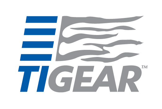
Client:
Tigear
Project:
Sportswear and equipment
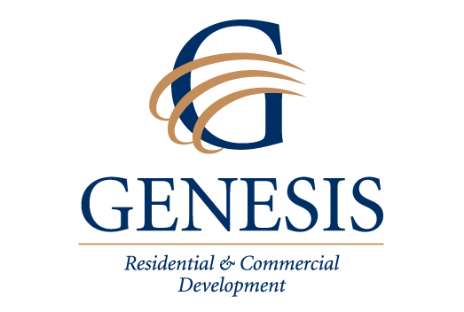
Client:
Genesis
Project:
Residential Real Estate Developers. The client wanted a globe incorporated into the logo. This was our fresher solution.
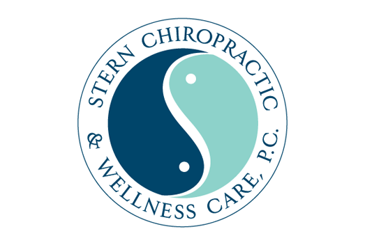
Client:
Stern Chiropractic
Project:
Chiropractic and wellness practice
Client:
Jaymark Jewelers
Project:
Jewelry Store, Cold Spring, NY
Client:
Friends of Fahnestock & Hudson Highlands State Parks (FoFHH)
Project:
Non-profit Friends group that supports the stewardship of the parks' natural and historical resources and educational and recreational opportunities. FoFHH expands 23,000 acres and spans the 3 counties of Westchester, Putnam and Dutchess in NY's beautiful Hudson Valley region.
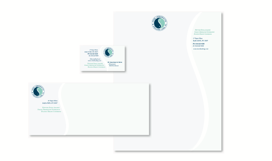
Stationery Applications
Client:
DellaCura Ltd.
Project:
100% natural skincare products comprised of essential flower, fruit and nut oils. The stationery also includes men's and women's Thank You cards that coordinate with their respective packaging.
Client:
DuraTile & Stone
Project:
Tile & Stone installation company
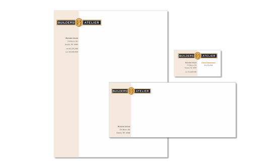
Client:
Builders Atelier
Project:
Custom home builders
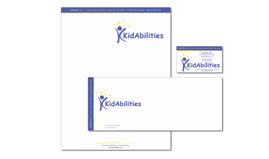
Client:
KidAbilities
Project:
Pediatric occupational and physical therapy practice
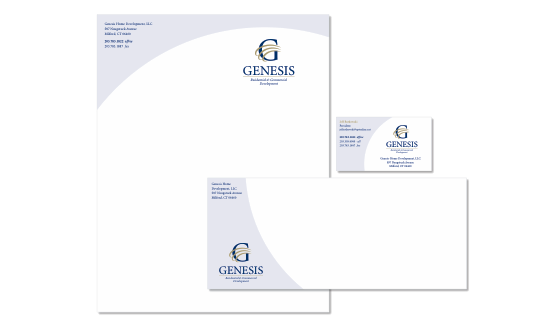
Client:
Genesis
Project:
Residential Real Estate Developers
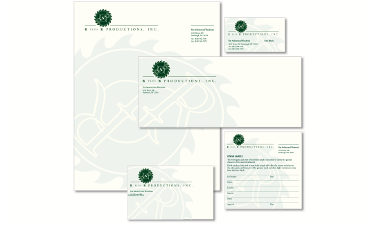
Client:
Richter+Ratner, international designer of custom retail environments and fixtures. R plus R Productions, a division of Richter+Ratner Contracting Corporation
Project:
R plus R Productions is their manufacturing division.
Client:
Stern Chiropractic
Project:
Chiropractic and holistic health counseling practice
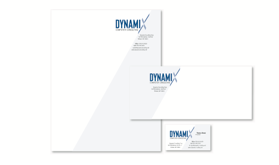
Client:
Dynamic Computer Consulting
Project:
Network installations and computer services